Introduction
Scandinavian design is known for its simplicity, functionality, and understated elegance. One of the defining characteristics of this design style is the use of a limited color scheme that includes whites, grays, and muted earthy tones. These colors are used to create warm, harmonious, and inviting spaces that are both visually pleasing and practical.
The Influence of Nature
Nature is an essential element of Scandinavian design, and it is no surprise that it also inspires the color palette. The region’s rugged landscape, dramatic coastline, and long winter nights have all influenced the use of whites, grays, and earthy hues. These colors reflect the Nordic climate and evoke a sense of calm, tranquility, and simplicity.
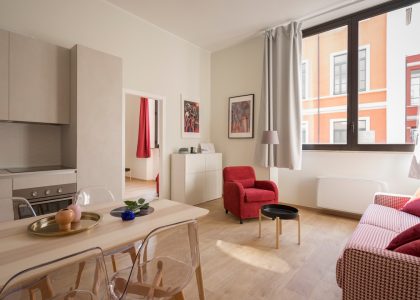
White
White is a cornerstone of Scandinavian design, representing purity, light, and simplicity. It is often used as a neutral base color, both on walls and in furnishings, to create a sense of spaciousness and airiness. White is also used to reflect light, making a room feel bright and inviting even on the darkest winter days.
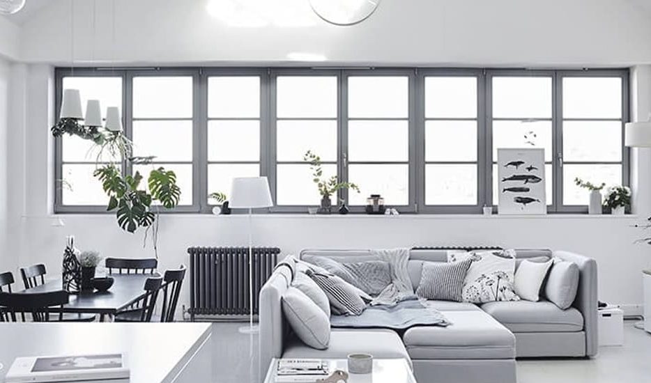
Gray
Gray is another popular color in Scandinavian design, ranging from light and cool to warm and earthy tones. It is a versatile color that complements the other colors in the palette, adding depth and contrast. Like white, it can be used as a neutral base color or as an accent in textiles, accessories, and furniture.
Earthy Tones
Earthy tones like beige, camel, and taupe are used to add warmth and texture to a room. These colors reflect the natural elements of wood, stone, and minerals that are prevalent in the region’s landscapes. They are often used in combination with white or gray to create contrast and interest.
The Role of Contrast
Another key element of Scandinavian design is the use of contrast. This involves combining light and dark colors, glossy and matte surfaces, and smooth and rough textures to create visual interest and variety. The result is a space that feels warm and cozy yet sophisticated and stylish.
The Psychology of Color
Color psychology plays a significant role in Scandinavian design. The colors used are not only aesthetically pleasing but also have a psychological impact on our mood and emotions. For instance, white is associated with purity, clarity, and freshness, while gray is linked to elegance, sophistication, and stability. Earthy tones like beige and taupe are associated with warmth, comfort, and relaxation.
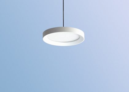
The Importance of Lighting
Lighting is also essential in creating a Scandinavian-inspired space. The light is used to enhance the colors and textures in a room, creating a warm and welcoming atmosphere. Natural light is favored over artificial lighting, and windows are often left unadorned to allow maximum light to enter the space.