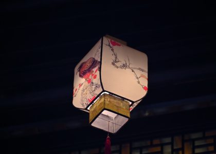
The Beauty of Imperfection: Exploring the World of Wabi Sabi Printing
Introduction
Wabi Sabi is a Japanese concept that embraces the beauty of imperfection and the transience of life. It is a philosophy or aesthetic that can be seen in various aspects, including art, architecture, and design. Wabi Sabi printing, therefore, is a form of printing that embraces the same principles. In this article, we will explore the world of Wabi Sabi printing and how it reflects the beauty of imperfection.
What is Wabi Sabi Printing?
Wabi Sabi printing is a form of printmaking that emphasizes simplicity, imperfection, and natural materials. It is a printing technique that has been around for centuries in Japan and is characterized by its unique texture and color. The technique involves using hand-carved blocks to press ink onto paper. The blocks are often carved with simple, repetitive patterns, which add to the beauty of the final print.
The ink used in Wabi Sabi printing is typically natural and renewable, such as vegetable-based or water-based inks. This approach contrasts with modern printing techniques that rely primarily on synthetic inks and materials. The natural inks used in Wabi Sabi printing produce vivid and nuanced colors that interact with the paper’s texture, enhancing the print’s unique qualities.
The Beauty of Imperfection
Wabi Sabi printing embraces the beauty of imperfection, which is a central theme in Japanese culture. This concept recognizes that nothing is perfect, and that includes art. In Wabi Sabi printing, the imperfections of the printing process are what give each print its unique character. The slight variations in color, texture, and pattern are what make each print a one-of-a-kind work of art.
Textures
Texture plays a vital role in Wabi Sabi printing, which is why natural paper is often used. Natural paper has an uneven texture, that when combined with the ink, results in a print with a unique texture. The texture of Wabi Sabi prints comes from the thickness of the ink and the way it interacts with the paper’s surface. The resulting texture gives each print a timeless quality and a connection to nature.
Colors
The colors used in Wabi Sabi printing are often inspired by nature, such as shades of green, brown, and blue. The vegetable-based inks used in Wabi Sabi printing produce a softer and more muted palette than modern synthetic inks. The combination of natural colors and the paper’s texture creates a harmonious and serene effect.
Patterns
The patterns used in Wabi Sabi printing are characterized by their simplicity and repetition. They often feature minimalist designs that are repeated in staggered or overlapping patterns. These patterns create a calming effect and a sense of continuity.


